|
Georgia Power's HR Intranet
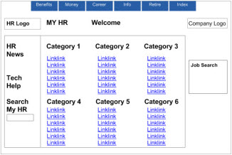
The Problem:
The sites front page tried to be a one-click shop by featuring links to a large number of its features. Although these were grouped beneath headings, people tended to overlook the categories, preferring to search the links one by one. Since 40 to 60 links appeared on category pages, this became a reading exercise and most users gave up after reading 10 or 15 items.
Groups of bright blue links grab attention and seem to dare people to "just find the right link" to save a click. But when there are too many links, it just becomes wearying.
|
|
 |
|
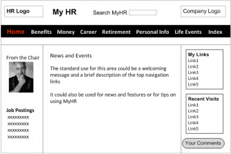
The Solution:
We eliminated the reliance on blue links and guided users to the navigation. When the user's mouse hovers above the navigation, text appears below the categories, describing that page's contents.
On category pages, headings are shaded and rendered in 14-point type, emphasizing them over the 11-point links, which themselves are large enough to be read by older adults.
The Results:
When tested the next year, participants were able to find 100% of items in our
usability tests a huge improvement over our tests on the original site. |
|
 |