Delta Air Lines |
 |
|
|
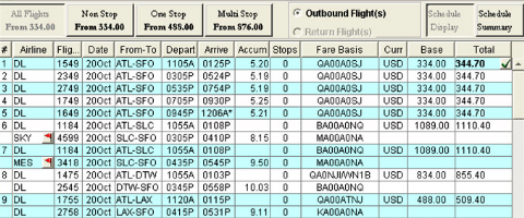
Redesign:
A more relaxed and readable look is achieved by adding white space between rows, deleting extraneous lines, and eliminating non-critical fields. At the top of the interface, additional
filters offer more functionality, yet occupy far less real estate. Flight prices - generally the agents' main focus - are enlarged and easily clickable for a
streamlined experience. Our redesign included dozens of other changes. | 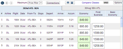 |
info@websosmart.com
(404) 313-1500